Facebook Infographic: If Facebook Were A Village Of 100 People
Two years ago, we published the original version of our If Facebook Were A Village Of 100 People Facebook infographic.
We think you will agree with us if we say that a lot happened in the world in two years.
Which is the reason why it seemed interesting to take a fresh look at Facebook’s audience and see how it has evolved in this timeframe.
Without further ado, here is the 2018 edition of our If Facebook Were A Village Of 100 People infographic:


How We Made This Facebook Infographic
Source data used in this infographic comes exclusively from Facebook Audience Insights.
Instead of focusing on a specific target audience, we looked at the entire Facebook audience (i.e. all Facebook users).
This process provided us with charts like this one…
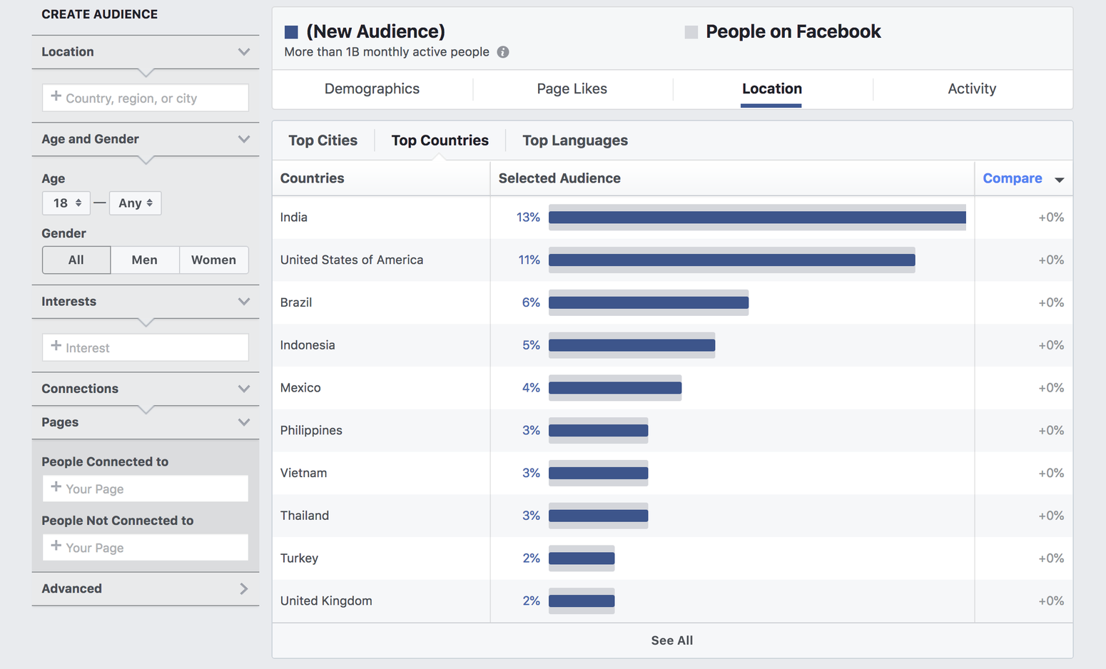
… which we then turned into eye candy.
What This Infographic Teaches Us
Here is a quick transcription & interpretation of our findings, in comparison with 2016 data:
- Gender:
- The numbers: if Facebook were a village of 100 people, 56 would be men and 44 would be women.
- The evolution: no change, the women/men ratio remained steady (56/44).
- Note: this is based on self-reported information from people on their profile and may not reflect exhaustively & accurately gender definition on the platform.
- Age:
- The numbers: if Facebook were a village of 100 people, 63 would be 18-34 years old and 4 would be 65+ years old.
- The evolution: the proportion of Millennials slightly decreased (63 vs. 64) while the proportion of Boomers slightly increased (4 vs. 3) on the platform.
- Relationship Status:
- The numbers: if Facebook were a village of 100 people, 38 would be single and 41 would be married.
- The evolution: the proportion of single people slightly decreased (38 vs. 39) while the proportion of married couples slightly increased (41 vs. 39) on the platform.
- Country:
- The numbers: if Facebook were a village of 100 people, 13 would be Indian, 11 would be American and 6 would be Brazilian.
- The analysis: the proportion of Indian users has increased (13 vs. 9) over the proportion of American users (11 vs. 13), while the proportion of Brazilian slightly decreased (6 vs. 7).
- City:
- The number: if Facebook were a village of 100 people, 1 would come from Dhaka, Bengladesh.
- The analysis: almost 1% of all Facebook users come from the capital and largest city of Bengladesh.
- Language:
- The numbers: if Facebook were a village of 100 people, 43 would speak English and 14 would speak Spanish.
- The analysis: the proportion of English speakers remained steady (43), while the proportion of Spanish speakers increased (14 vs. 10) on the platform.
- Education Level:
- The number: if Facebook were a village of 100 people, 68 would hold a college degree.
- The analysis: the proportion of college graduates slightly decreased (68 vs. 69) on the platform.
- Job:
- The number: if Facebook were a village of 100 people, 24 would occupy a management position.
- The analysis: the proportion of users occupying a management position decreased by a third (24 vs. 36) on the platform.
- Device:
- The number: if Facebook were a village of 100 people, 92 would primarily mobile users.
- The analysis: the proportion of primarily mobile users significantly increased (92 vs. 84) on the platform.
- OS:
- The number: if Facebook were a village of 100 people, 48 would use Android and 16 would use iOS.
- The analysis: both the proportion of Android users (64 vs. 48) and the proportion of iOS users (20 vs. 16) increased significantly on the platform, respectively by one third and one fourth.
Share this Facebook Infographic Around You
If you enjoyed this Facebook infographic, you can tweet it in one click from here or embed it easily on your website with the code below:
You can also find it here as a presentation on Slideshare and there as a video on Instagram.
Loomly is a simple social media calendar tool that helps you create better content for your audience (including on Facebook): start your 15-day free trial now.